The U.S. employment news last week appeared very positive. However, there’s good news and bad news.
There are a lot of charts in this report. Being a statistics freak, I love charts because they bring dry numbers to life. However, I realize not everyone is a chartist so I’ve tried to keep these charts as simple as possible. Once you’ve seen a few of these charts you’ll soon realize they’re all going downhill.
But, first the good news. Below are headlines from several propaganda cheerleaders; MarketWatch, CNN, the New York Times and the Financial Times.
U.S. economy adds 243,000 jobs in January; unemployment rate falls to 8.3%
02/03/2012 08:30:59 AM
By Jeffry Bartash, MarketWatch
WASHINGTON (MarketWatch) — “The U.S. gained 243,000 jobs in January and the unemployment rate dipped to 8.3% as most sectors of the economy added workers, the Labor Department said Friday.
“The increase in hiring was the biggest since last April and supplies further evidence that the economy continues to strengthen after a slowdown last summer. The U.S. has added an average of 183,000 jobs a month in the past five months.
“Hiring has also become more broad based. Jobs were added last month in manufacturing and construction, professional services, retail, health care and food and restaurant establishments.”
CNN 2-03-12
“U.S. employers stepped up their hiring in January, bringing the unemployment rate down for the fifth month in a row.
“Employers added 243,000 jobs in January, the Labor Department reported Friday, marking a pick-up in hiring from December, when the economy added 203,000 jobs. Meanwhile, the unemployment rate fell to 8.3% from 8.5%.”
Breaking News Alert
The New York Times
Friday, February 3, 2012
“U.S. Economy Added 243,000 Jobs in January; Unemployment Dips to 8.3%.”
“The United States economy gained momentum in January, adding 243,000 jobs, the second straight month of better-than-expected gains, the Labor Department reported on Friday. The unemployment rate fell to 8.3 percent. The promising jobs numbers came as various economic indicators have painted an ambivalent picture of the recovery’s strength.”
Financial Times
US unemployment drops to 8.3%
“The US economy added 243,000 jobs in January and the unemployment rate dropped to 8.3 per cent.
“The labour department’s nonfarm payrolls report exceeded economists’ expectations of 145,000 new positions last month, compared with a better-than-expected 200,000 in December.”
Gerold again: Let’s briefly examine this so-called news. In the first place, more than half this “jobs growth” came from service-related small businesses. Yes, there was a healthy increase in a broad job base including manufacturing, construction, health care and professional jobs. However, almost 60% of these new jobs are really just low-paying McJobs in restaurant, food services and retail that do NOT replace the millions of high-paying (middle class) manufacturing jobs that have permanently moved to Asia. In other words, the important thing isn’t the number of jobs but the quality of jobs.
Let’s not forget revisions. Headline news is spun positively then later, revised numbers are buried. Out of sight, out of mind. Keep ‘em ignorant down on the farm and maybe they’ll vote for Obama again. This is what one commenter called, “The most efficient machine in history for financially violating a population in broad daylight.”
And, of course, there’s selective reporting. Simply put, this means reporting good news and ignoring bad news. Household jobs data versus Establishment data; whichever is positive is reported and the negative is ignored.
Buried within the above news stores are some very telling details. For instance, MarketWatch admitted: “Although hiring has accelerated since the end of last summer, the U.S. still has a long way to go to recoup all the jobs lost during the 2007-2009 recession. As of last month, 12.76 million people were officially classified as unemployed, and 5.5 million have been without a job for more than six months. That was little changed from December.
“Looked at another way, the unemployment rate is an even higher 15.1% if the data includes people with part-time positions who cannot find full-time jobs and those who have recently given up looking for work.
“The U.S. would need to add about 250,000 jobs a month for several years to bring the unemployment rate back down to pre-recession levels. The jobless rate ranged from 3.8% to 6.2% in the seven years prior to the 2007-2009 recession.
“Also Friday, the Labor Department said average hourly earnings rose by 4 cents, or 0.2%, to $23.29 in January. That was in line with expectations. The average workweek was unchanged at 34.5 hours.”
CNN admitted: “But the job market still has a long way to go to fully recover from the financial crisis. The economy still needs to add about 6 million jobs to get back to 2008 employment levels.”
And, The Financial times reported: “Friday’s data followed a report on private job creation from payroll processor ADP that said US companies added 170,000 new workers, below expectations.” And, they might have added, well below the government’s fudged numbers.
In other words, two months of good news does not make a trend. Here are two charts that do put this into perspective. Note the steady job increase from 1961 to 2001 when the long term trend broke down and was unable to get back to the long term trend. Yes, the recent upswing is positive but not nearly enough to re-establish the long term trend and the current number of jobs is still below the 2001 peak. The second chart below showing percentage also puts this into perspective.
Then there’s the news that’s buried without any detail or follow-up. Here’s two stories with no details given:
CNN 2-01-12
American Airlines says it plans to cut 13,000 jobs as it attempts to emerge from bankruptcy.
American Airlines reportedly set to cut up to 14,000 jobs
MarketWatch 02/01/2012 02:26:32 PM
[No story]
Gerold again: I’ve said this over and over again and nobody seems to be listening and few analysts have connected the dots: INFLATION makes the numbers look better.
Government bullshit numbers make inflation look less than 3%. However, they are using various fudging techniques that I’ve mentioned in previous commentary.
John Williams of ShadowStats, using pre-1980 (non-fudged) methodology, shows the real inflation rate is over 11%. See this chart.
.
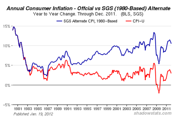
Government fudged numbers are red. ShadowStats real numbers are blue.
This makes the following headline a joke.
U.S. factory orders up in December
02/03/2012 10:02:38 AM
By Greg Robb
“WASHINGTON (MarketWatch) – Factory orders rose 1.1% in December, the Commerce Department reported Friday. Economists polled by MarketWatch had expected a 1.4% rise.”
In other words, adjusted for the real inflation rate, U.S. manufacturing is contracting at almost 10% a year. That’s a recovery? No, that’s a continuing collapse. That’s the slow motion train wreck I predicted in 2007.
However, the most important news is the news that’s NOT reported in the news. Trust Tyler Durden of ZeroHedge to reveal how bad the jobs situation really is in the U.S. He says. “1.2 million people dropped out of the labor force in one month!” The labor force increased from 153.9 million to 154.4 million so those not in the labor force rose from 86.7 million to 87.9 million. He says it means that, “the civilian labor force tumbled to a fresh 30 year low of 63.7% as the BLS is seriously planning on eliminating nearly half of the available labor pool from the unemployment calculation.”
.
This is the latest craven attempt to fudge the numbers. With statistical sleight of hand, the unemployed simply disappear from the numbers and make Obama look good. The chart below shows the people NOT in the labor force increasing for the last three years. Note the sudden jump highlighted in pink at the end. Those are the recently “disappeared”.
.
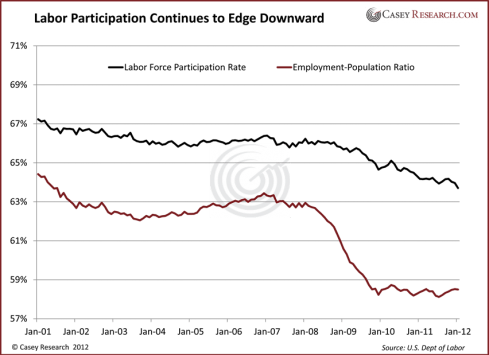
Just as important is the labor force participation rate, another number you won’t see in the news and another indication how the U.S. government will spin its bullshit on the backs of the unemployed.
.

Charts: Bloomberg
.
Durden says, “This is the largest absolute jump in ‘Persons Not In Labor Force’ on record…and biggest percentage jump in 30 years.”
Here’s what Vedran Vuk of Casey Research says about the labor participation rate on the chart below. “Workers continue to drop out of the job market. In fact, the labor participation rate continues moving downward in an ugly trend.”.
.
“While the employment-to-population rate has at least flatlined, labor participation remains a major problem. Hidden in these numbers is a shadow inventory of unemployment. Whether it’s students who have gone back to school or those who have simply stopped looking for work, there is a long list of people who will eventually start looking for jobs again. Especially if the unemployment rate continues to fall, more people will enter back into the job market.”
Gerold note; as this shadow unemployment inventory starts making its way back into the labor market it will dampen the employment rate the same way the bank’s shadow housing inventory keeps house prices low.
Here are a few more interesting charts courtesy of John Williams of ShadowStats.com. If you’re American with money or assets to protect, you’d do well to subscribe to John’s service.
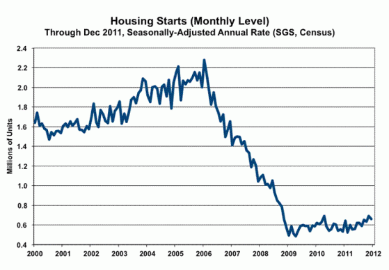
Here is a chart of U.S housing starts.
.
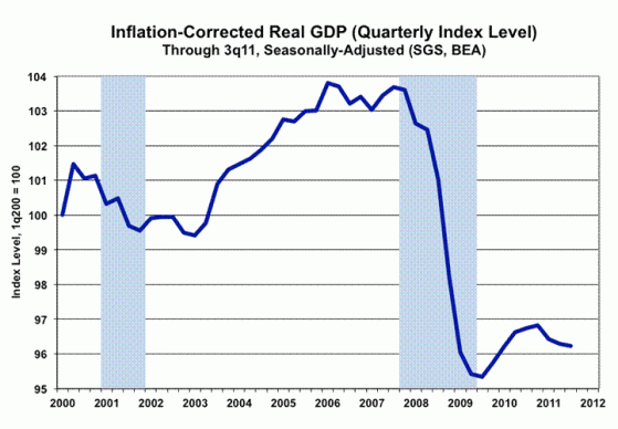
The chart below is real U.S. GDP using old-style, non-fudged methodology.
.
.
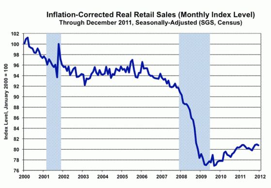
Below is real retail sales deflated by the traditional, as contrasted with the current, substitution-based, measure of inflation.
.
.
In other words there is no recovery in the U.S. It’s all hype, spin, propaganda, smoke and mirrors. It’s even more so now that America is in another election year circus.
As Paul Craig Roberts says, “A government and media that will deceive you about simple things such as inflation, unemployment, and GDP growth will lie to you about everything.”
This post has been about the deteriorating U.S. economy. Whither goes the largest economy in the world, so goes the rest of the world, especially now with Europe melting down and China & the rest of the BRICS slowing.
Stay tuned. My next post will be “Canada’s Inevitable Collapse”. Just one of several items I’m researching: Canada’s housing bubble is 25% to 40% ABOVE the American bubble at its peak. Remember what I said in my 2007 post: “bubbles collapse”. Canada’s bubble will be no different. If you’re a Canadian boomer who thinks you can retire on the basis of the equity in your home, you’ll have a rude awakening in the near future.
What can you do? All the things mentioned in previous articles: reduce debt, get out of debt, stay out of debt, prepare for collapse, stockpile essentials, keep your mouth shut, etc. etc.
The Stoic Philospher Epictetus said, “Make the best use of what is in your power, and take the rest as it happens.” He also said, “It’s not what happens to you but how you react to it that matters.”
It’s important you focus on the things you CAN change and not let the things you cannot change distract or discourage you.
Stay tuned. Knowledge is power.
Gerold
February 4, 2012
Your comments are WELCOME!
If you like what you’ve read or not, please “Rate This” below.
Lengthy comments may time-out before you’re finished so consider doing them in a word doc first then copy and paste to “Leave a Reply” below.


